Published on 09/October/2026 · Nature
2100: how much warmer could the world become?
By SORAH Editorial
Two emissions pathways, one shared colour scale. Compare warming relative to 1995–2014.
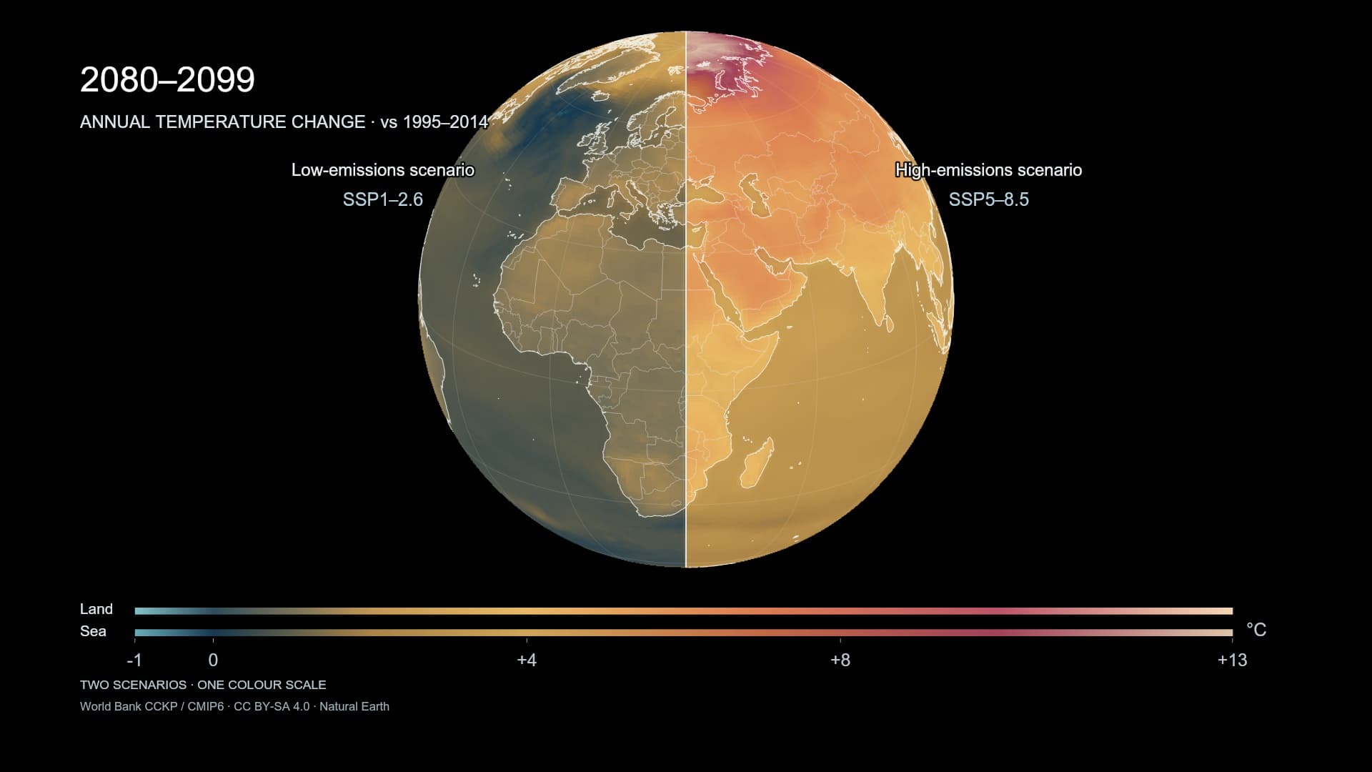
Look at the same Earth in the same future period. Low emissions appear on the left, high emissions on the right. The central line is not a border. It separates two sets of conditions about the path ahead. As the globe rotates, the distant date “2100” becomes a difference in temperature over places where people live.
WMO’s report released in 2026 puts the global mean temperature of 2025 at approximately 1.43°C above the pre-industrial level. Warming is already part of experience. This map looks farther ahead: the average for 2080–2099, expressed as a change from the 1995–2014 average. [4]
Two futures on one colour scale
SSP1-2.6 and SSP5-8.5 represent different pathways for society and emissions. Keeping the colour scale fixed allows a direct comparison. Viewed alone, either half is a warming world. As a familiar longitude passes through the dividing line, the consequences of different conditions become easier to see.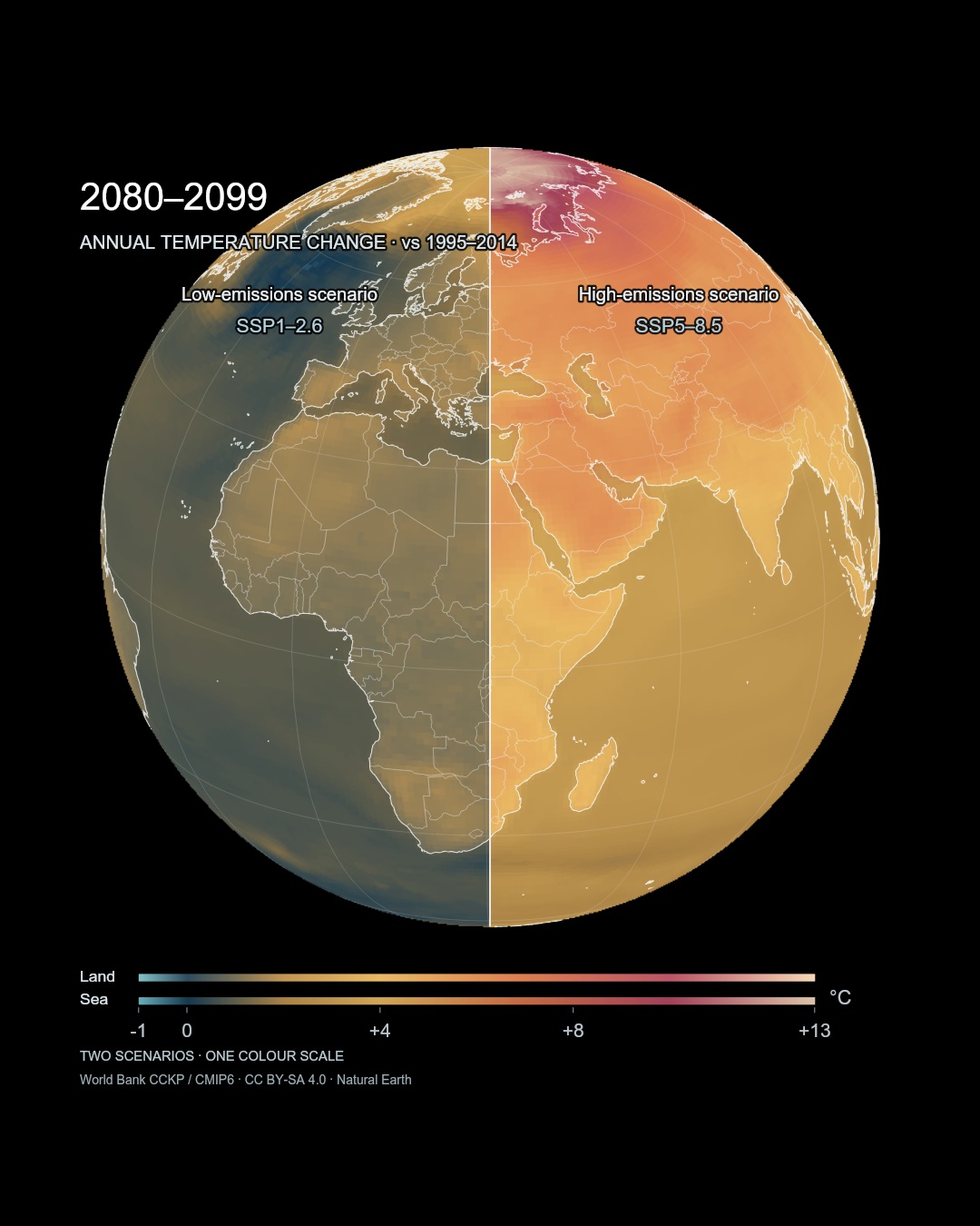
Mean annual temperature change for 2080–2099. Both halves use the same temperature scale; land and sea have separate base colours.
The time represented here differs from a weather forecast. A twenty-year average looks past individual hot and cold days towards the background climate of everyday life. A changing background also changes the horizon for decisions about buildings, farmland and the trees that will shade a street.
Warming does not colour the Earth evenly
Rotating the globe brings stronger colours into view over high-latitude land. The IPCC describes larger warming over land than ocean and in the Arctic than the global average. Knowing one global number is not enough to locate a particular region within that changing pattern. [3]An ocean shown in gentler colours is not an ocean detached from change. This map encodes near-surface air temperature. Heat held within the water and conditions experienced by marine life need other observations. Understanding what a map measures also helps us ask what remains outside it.
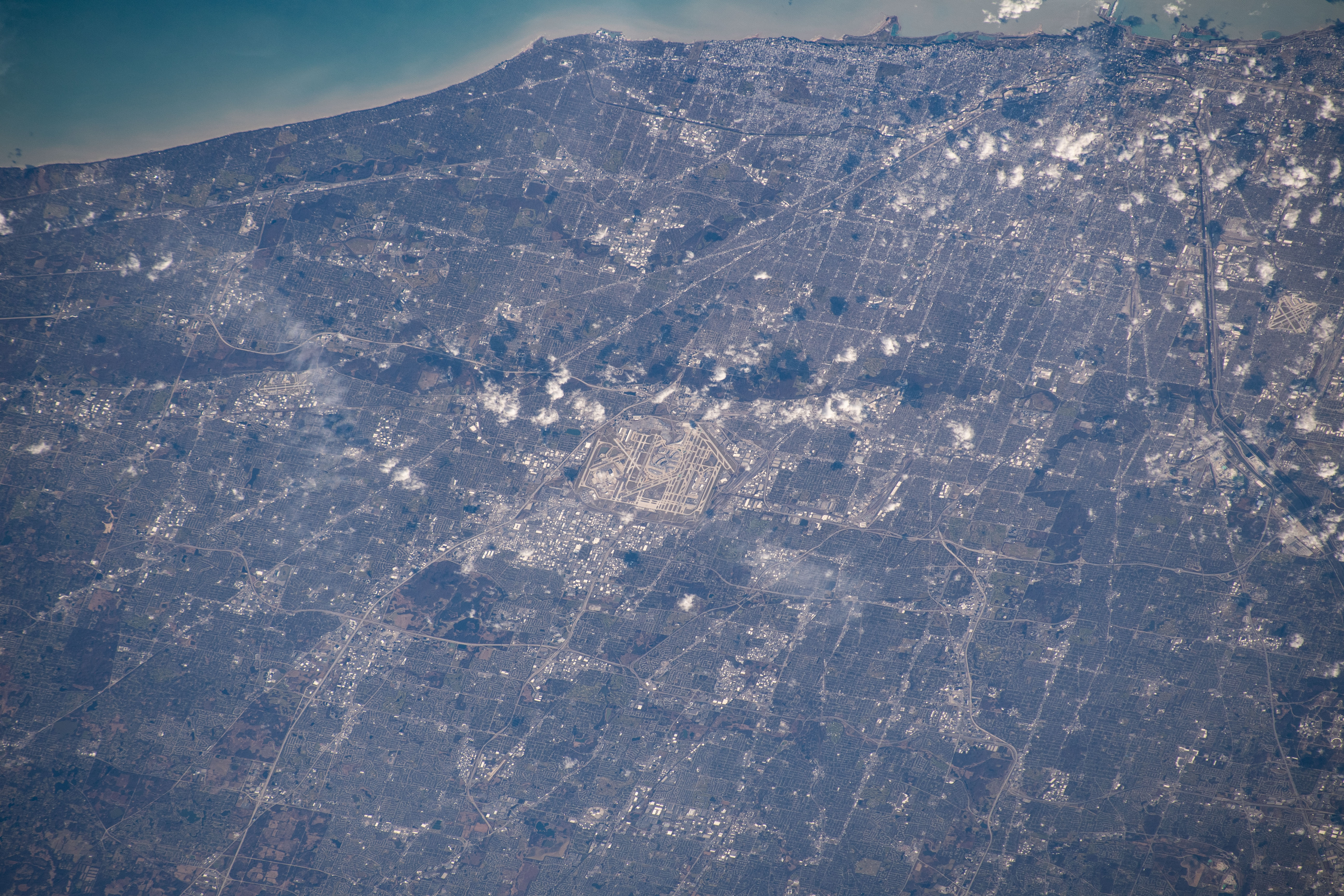
Chicago and O’Hare airport in an ISS photograph used in NASA’s urban-heat research article. Photograph undated. NASA, ISS061-E-067911. 出典 / Source
From a hot street to decisions that last
Urban heat also depends on the surroundings people inhabit: buildings, paving and vegetation. Research on green roofs in Chicago described by NASA found that cooling outcomes differed between sites. Reading regional climate and measuring the heat of an actual place are connected tasks, but they operate at different scales. [5]A few degrees of annual warming may sound modest when compared with the weather’s daily variation. Yet the map describes a shift in the background, not the rise and fall within a day. Consider the lifetime of a home, the time needed for trees to grow, or the decades of service expected from local infrastructure. The end of the century no longer looks separate from choices being made now.
What the dividing line leaves open
The IPCC finds that each additional increment of warming increases multiple hazards and risks, while deep and sustained emissions cuts limit warming. Comparing scenarios makes the role of changing conditions visible rather than turning the future into a single predetermined picture. [2]The rotating Earth brings familiar cities and unvisited regions across the same line. Each place encounters a different set of conditions. That visible distance between futures can become a way to think about what we build, keep using and choose to reduce over time.
Data and interpretation
World Bank CCKP CMIP6 mean annual temperature differences, twenty-year periods 2020–2039, 2040–2059, 2060–2079 and 2080–2099; baseline 1995–2014. Video rotates through one globe in twenty seconds at fixed 2080–2099. Data Scape also changes period.Provider model medians: 27 low-emissions and 28 high-emissions models. Original 0.25° fields sampled to 1° for display. Scenarios are conditions, not forecasts or probabilities. The map baseline differs from the pre-industrial 1850–1900 reference in the WMO figure.
Land and sea use different base colours, with common temperature breakpoints and two legends. Values represent air-temperature differences, not ocean or street-surface temperatures. Coastlines and borders: Natural Earth. The photograph provides urban context, not an image of a projected future.
The source files specify CC BY-SA 4.0; the derived visualisation and extracted data use the same licence. Source: World Bank CCKP / CMIP6; adaptation: SORAH. The film of medians does not display the full model spread.
Sources
Author
SORAH Editorial
October 9, 2026