Published on 01/October/2026 · Climate
An electrified Earth. Lightning has a seasonal geography.
By SORAH Editorial
Ten years of observations turn brief flashes into a map of how activity changes through the calendar.
Ten years of observations turn brief flashes into a map of how activity changes through the calendar.
Explore lightning seasonality in Data Scape
Pale yellow-white light spreads across the globe. Move from January to July and its outline changes. Lightning does not keep the same geography throughout the year. Comparing months reveals a seasonal pattern within an event that usually disappears almost as soon as we see it.
This twenty-second film cycles through monthly climatologies for 2012–2021. Each frame represents a calendar month across that ten-year period, not a day in a particular year. The map compares lightning stroke density, rather than replaying individual storms. [1]
![January lightning stroke density, using the 2012–2021 monthly climatology. Brightness represents strokes per square kilometre per day. [1]](/images/articles/lightning/01-january-en.jpg)
January lightning stroke density, using the 2012–2021 monthly climatology. Brightness represents strokes per square kilometre per day. [1]
A brief flash, a seasonal pattern
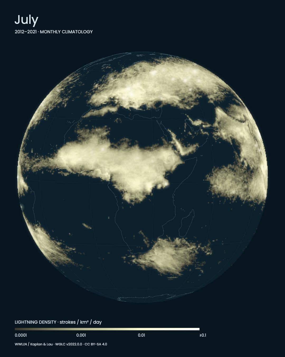
A storm outside our window tells us about the sky nearby. It tells us much less about conditions on another continent. Here, a fixed viewpoint and a shared colour scale let us compare places within the same season, then return to those places in a different month.Between January and July, the bright regions around Africa shift, while the northern hemisphere acquires a different spread of light. The globe remains still: the changing shape comes from the monthly distribution, not from a moving camera.
![July, with the same viewpoint and scale as January. Twinkling illustrates density; it does not reproduce the timing of observed strokes. [1]](/images/articles/lightning/02-july-en.jpg)
July, with the same viewpoint and scale as January. Twinkling illustrates density; it does not reproduce the timing of observed strokes. [1]
When air can rise
Thunderstorms need moisture, unstable air that can continue rising, and something to initiate that upward movement. Warmth alone is not the whole explanation: the ingredients must come together. [3]The monthly sequence encourages a different kind of attention. Instead of following the track of one storm, we watch where activity is concentrated and how that pattern differs through the calendar. A bright place belongs to a broader geography.
From a ground network to a global view
The source is WGLC, a gridded dataset based on lightning radio signals detected by the worldwide ground network WWLLN. Its processing accounts for differences in the network’s detection efficiency. [1][2]![The July distribution on a world map. The unit is strokes / km² / day; every location uses the same logarithmic scale. [1]](/images/articles/lightning/03-world-en.jpg)
The July distribution on a world map. The unit is strokes / km² / day; every location uses the same logarithmic scale. [1]
These twelve maps describe seasonality. They do not, by themselves, show whether lightning is increasing from one year to the next. That question requires a different comparison, with years kept separate rather than combined into calendar-month averages.
On the next loop, keep your attention on one continent. Notice when the light spreads and when its outline contracts or moves. Stepping back from a single flash lets a place’s position within the year come into view.
Note · Data and representation WGLC v2022.0.0; 2012–2021 monthly climatology on a 0.5° grid. Fixed logarithmic scale: 0.0001–0.1 strokes / km² / day, saturated at the upper limit. Twinkles are illustrative, not observed flash timestamps or individual ground-strike locations. Twelve discrete months are shown in twenty seconds, without synthesizing intermediate observations. WWLLN / Kaplan & Lau; data and adapted figures/video: CC BY-SA 4.0. [1][2]
Sources
Author
SORAH Editorial
October 1, 2026