Published on 23/September/2026 · Climate
The Hottest Summer on Record. But the Heat Was Uneven.
By SORAH Editorial
It was the hottest June–August period in NASA’s record. Yet the heat was uneven. Looking from the global average back to the map reveals the differences behind the number.
June–August 2026 set a global record in NASA’s temperature series. The geography behind that average tells a more varied story.
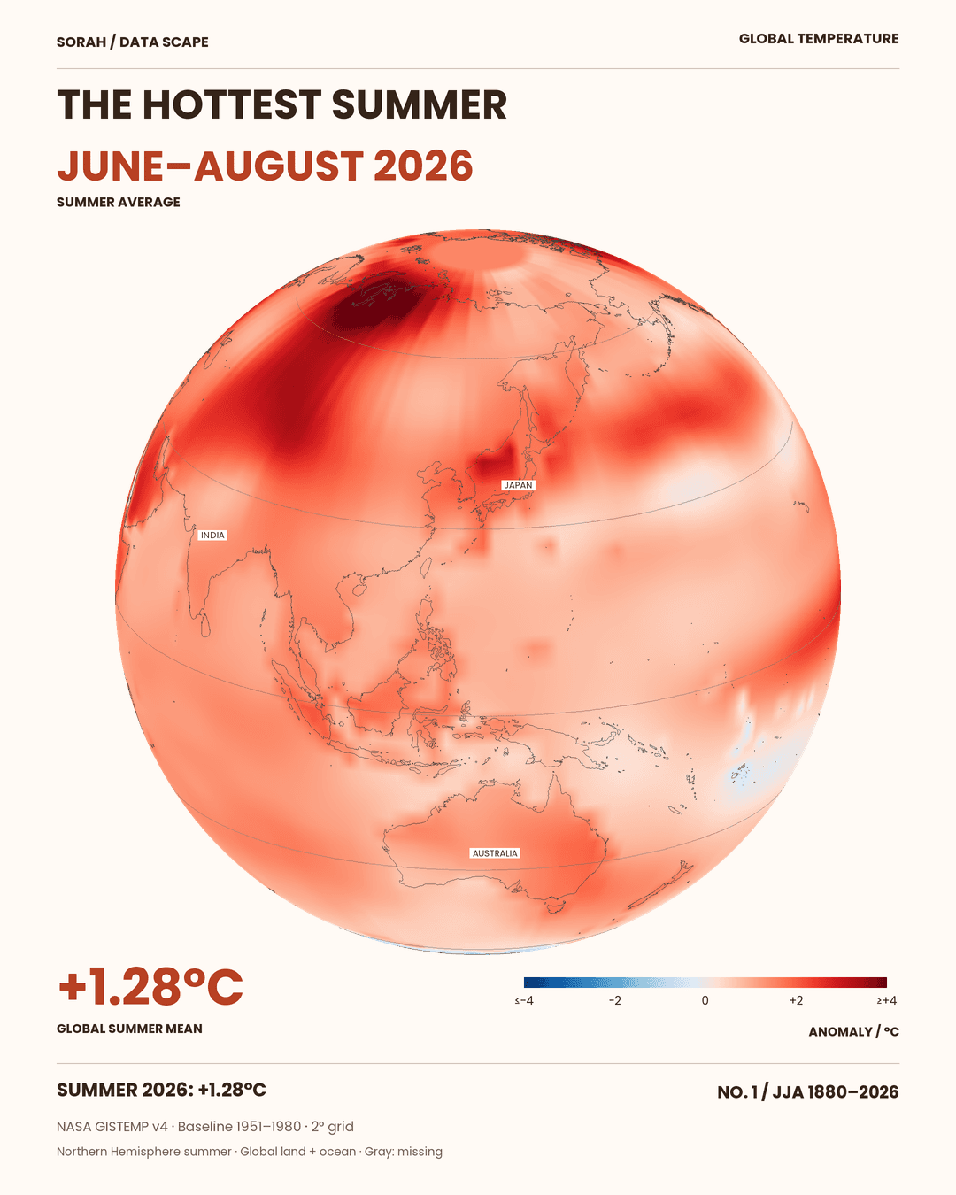
It was the hottest June–August period in NASA’s temperature record, which begins in 1880. Yet the heat was uneven. Deep red stretches across northern Eurasia. Much paler shades cover parts of the Pacific. These views show the same three months, but very different departures from the climate each place once experienced.[1][2]
A global average brings those differences together. Looking back from that number to the map opens another question: where did temperatures move furthest from their local baseline, and what did that summer mean for the people living there?
![Mean temperature anomalies for June–August 2026, relative to 1951–1980. Red means warmer than the local baseline; blue means cooler. The colors do not show absolute temperatures. SORAH visualization of NASA GISTEMP v4.[5][6]](/images/articles/global-temperature/02_asia.png)
Mean temperature anomalies for June–August 2026, relative to 1951–1980. Red means warmer than the local baseline; blue means cooler. The colors do not show absolute temperatures. SORAH visualization of NASA GISTEMP v4.[5][6]
What +1.28°C tells us
NASA’s published global value for June–August 2026 is 1.28°C above the 1951–1980 average for the same season. It exceeds the previous high, 1.25°C in 2024, by 0.03°C in the published series. That comparison covers 147 June–August periods, from 1880 to 2026.[2]“Summer” refers here to the Northern Hemisphere season. The average includes the Southern Hemisphere, where those months were winter. NASA combines near-surface air temperatures over land with sea-surface temperatures. The resulting global record does not imply a record summer in every country.[1]
Nor does a 0.03°C difference, on its own, establish a sudden acceleration in warming. Observational gaps and analysis introduce uncertainty. The ranking describes NASA’s published estimates. The baseline also matters: this 1.28°C cannot be directly compared with the Paris Agreement’s 1.5°C threshold, which uses a pre-industrial reference period.[1][3]
Reading the shades of red
A place that is normally cold can appear deep red. Its change from its own baseline may be large even when its actual temperature is lower than that of a tropical location. Blue is not a direct measure of cold weather or human comfort either. The map first tells us how far each place departed from its reference climate.[5]To check the contrast, SORAH calculated area-weighted means for two fixed rectangles in the original grid. One in northern Eurasia averaged approximately +2.7°C; another in the equatorial western Pacific averaged about +0.7°C. Both use the same June–August period and 1951–1980 baseline. These are selected geographic windows, not national statistics or averages for entire named regions. Their coordinates are listed below.[6]
Both were warmer than their baseline. They did not warm by the same amount. Turning to the Americas reveals another distribution. Keeping the color scale fixed allows a comparison across the planet without changing what a shade of red means.
![The Americas view shows the same June–August 2026 average, baseline and color scale. This is a change of viewpoint, not a later point in time.[5][6]](/images/articles/global-temperature/03_americas.png)
The Americas view shows the same June–August 2026 average, baseline and color scale. This is a change of viewpoint, not a later point in time.[5][6]
Why the heat was uneven
Earth’s surface does not warm at a uniform rate. Long-term warming differs between land and ocean and between latitudes. Meanwhile, sea-surface temperatures and atmospheric circulation change from month to month and season to season. The maps contain both the long-term shift and the particular ocean and atmospheric conditions of this summer.[8][9]For Japan, the Japan Meteorological Agency identified a specific combination. A meandering jet stream helped establish warm high pressure over western Japan, with descending air contributing to hot, dry conditions. The warmer atmospheric background caused by global warming also played a role.[11]
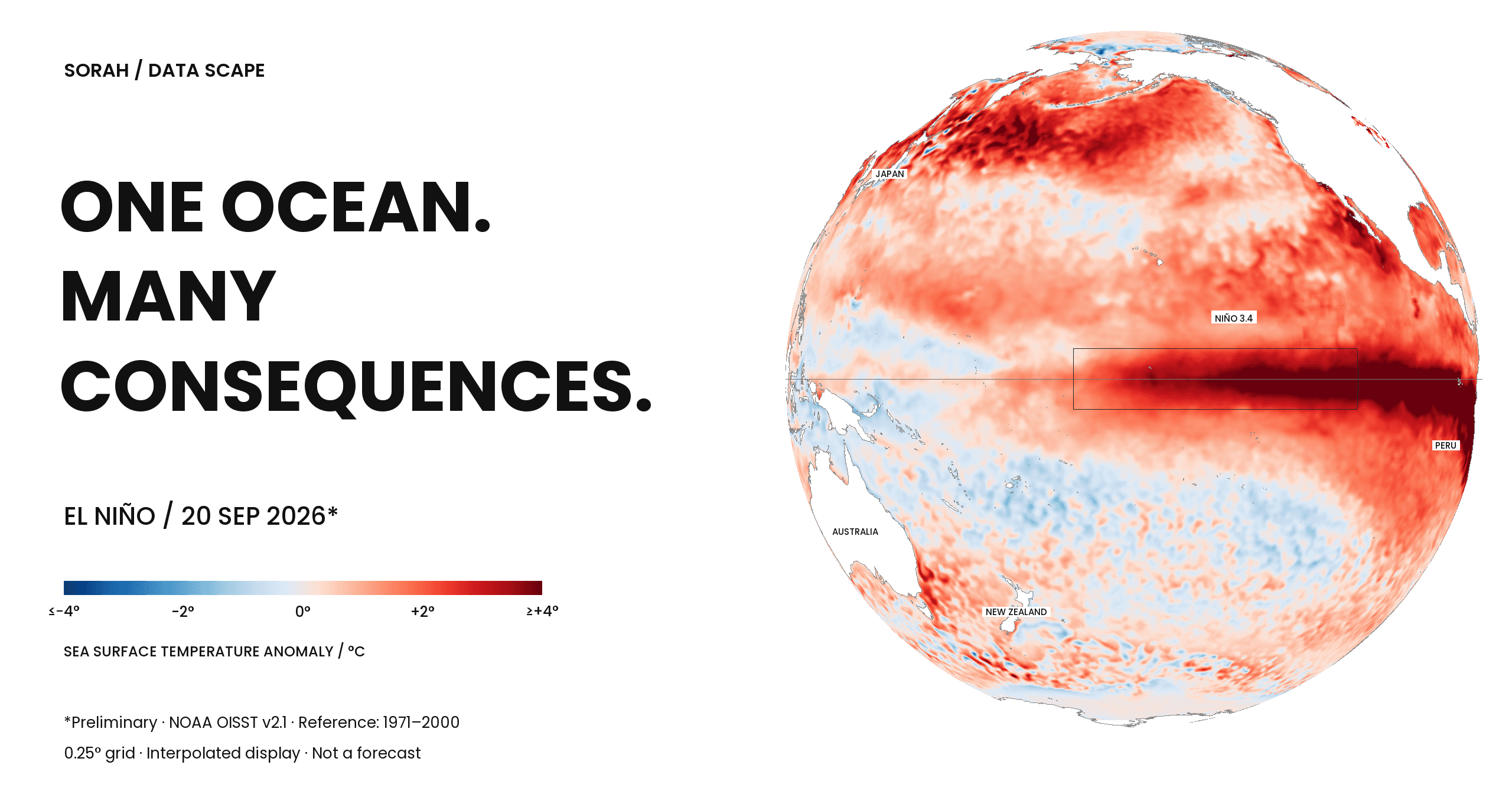
El Niño was part of the wider context. Yet JMA also found features in the Eurasian jet stream that differed from past El Niño patterns. “It was an El Niño year” cannot explain every red patch. Japan’s analysis cannot simply be extended to northern Eurasia or the entire world.[11]
This distinction matters when reading a compelling image. A temperature field shows an outcome. Explaining that outcome requires observations of circulation and other conditions, and sometimes dedicated attribution studies. The shape of a red patch alone cannot identify its cause.
A temperature map is not a map of harm
A global record can coexist with a lower regional ranking. JMA reports that Japan’s June–August 2026 mean was its fifth highest since 1898, at +1.02°C relative to 1991–2020. That anomaly cannot be compared directly with NASA’s global figure because the geographic coverage and reference periods differ. The rankings still make the distinction clear: the warmest summer globally need not be the warmest summer in Japan.[12]Human exposure adds another layer. Humidity, warm nights, outdoor work, housing and access to cooling all affect the burden of heat. WHO describes vulnerability as shaped by health and physiological factors as well as occupation and socioeconomic conditions.[10]
A pale area on the anomaly map may therefore still contain people experiencing dangerous heat. Seasonal averages can also conceal short heatwaves and nights that offer little relief. Moving from the globe to a city requires daily weather records and information about the people and environments exposed. The map is a starting point for that investigation, not a ranking of damage.
From a global record to a particular place
The global average is essential to understanding the direction of planetary change. Understanding a particular summer requires returning to its places and days.These globes hold different experiences of the same three months. What was the circulation doing over the deepest red? Did nighttime temperatures fall in a city beneath a paler shade? Beyond a single record-breaking headline are many local summers still worth examining.
About the data
Period: June–August 2026. Global values and rankings use NASA GISTEMP v4’s published JJA column; the CSV checked on 23 September 2026 matched the previously downloaded version. Maps equally average three monthly 2° fields with NASA’s 1,200 km analysis smoothing, requiring all three months to be valid; display interpolation is applied. SORAH’s regional comparisons use cosine-latitude area weights over 50–70°N, 60–120°E and 10°S–10°N, 130–170°E. Cell-center bounds are lower-inclusive and upper-exclusive, without a land–ocean mask. All 300 and 200 cells respectively were valid. Results of +2.736°C and +0.712°C are rounded to one decimal; values depend on boundary choice. These maps show neither harm nor attribution. The video holds the same June–August mean throughout one 24-second globe rotation. The date, global mean, color scale and magnification remain fixed. Only the viewpoint changes; no temporal interpolation or monthly field changes are shown.Sources
- NASA GISS — GISTEMP v4
- GISTEMP 月次CSV
- Lenssen et al. (2024) — observational uncertainty
- Notion — 2026年は観測史上最も暑い年になるか
- NASA GISTEMP — 2°格子データ / 1200 km解析平滑化
- NASA GISTEMP 格子データ NetCDF
- Natural Earth — 1:50m land / coastline
- NOAA — Global warming FAQ(一般的な仕組み・アーカイブ)
- NOAA — El Niño / La Niña FAQ(一般的な仕組み・アーカイブ)
- WHO — Heat and health
- 気象庁 — 令和8年夏を対象とした異常気象分析検討会(2026-09-01)
- JMA / TCC — Seasonal Highlights, June–August 2026(2026-09-23取得)
Author
SORAH Editorial
September 23, 2026