Published on 25/September/2026 · Nature
Will Migratory Birds Be Able to Keep Making These Journeys?
By SORAH Editorial
A map of 112 species leads from movement across the planet to the places that make each journey possible.
A map of 112 species leads from movement across the planet to the places that make each journey possible.
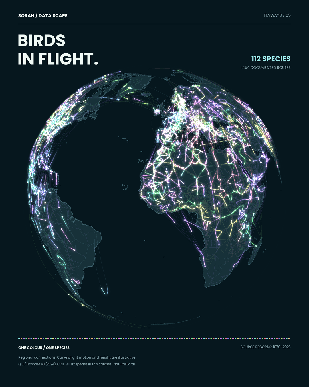
Across a dark globe, light travels over oceans and continents. Choose a colour and one bird species emerges from the crowded image. Follow it far enough and the spectacle becomes a more specific question: what happens in the places between departure and arrival?
This visualisation brings together migration records for 112 species. It invites us to watch movement. But movement is only part of the story. To understand how a journey can continue, we also need to look at the places where birds stop.
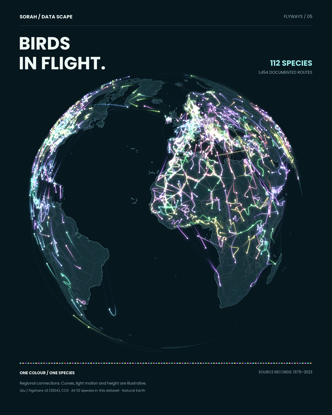
Regional connections from 112 species and 1,454 routes. Light count and speed do not represent bird abundance or flight speed. Some source records still require verification. [1]
112 species, one globe
The map uses version 3 of a migration-network dataset released by Yunbo Qiu in 2024. It contains 1,454 routes for 112 species, with record years spanning 1979–2023. We assigned a colour to each species and connected the regional locations on a rotating globe. [1]This is a view across many records, not a live display of birds travelling together. The underlying nodes represent regions, including administrative areas. Curves connect those nodes; animated light helps the eye follow them. Neither the curves nor their speed reconstruct the flight of an individual bird.
That distinction changes how to read the image. A bright cluster is a place to investigate, not proof of exceptional bird abundance. Research effort differs among species and regions. The species selector lets a viewer move from the dense global picture to a smaller set of connections—and see how much the picture changes with that choice.
Different journeys, a shared stopover
The Yellow Sea, between China and the Korean Peninsula, offers a way to make those connections concrete. A 2012 tracking study by Battley and colleagues compared two bar-tailed godwit subspecies. Northbound baueri travelled from New Zealand towards Alaska; menzbieri travelled from northwestern Australia towards eastern Russia. Both used the Yellow Sea to refuel. [6]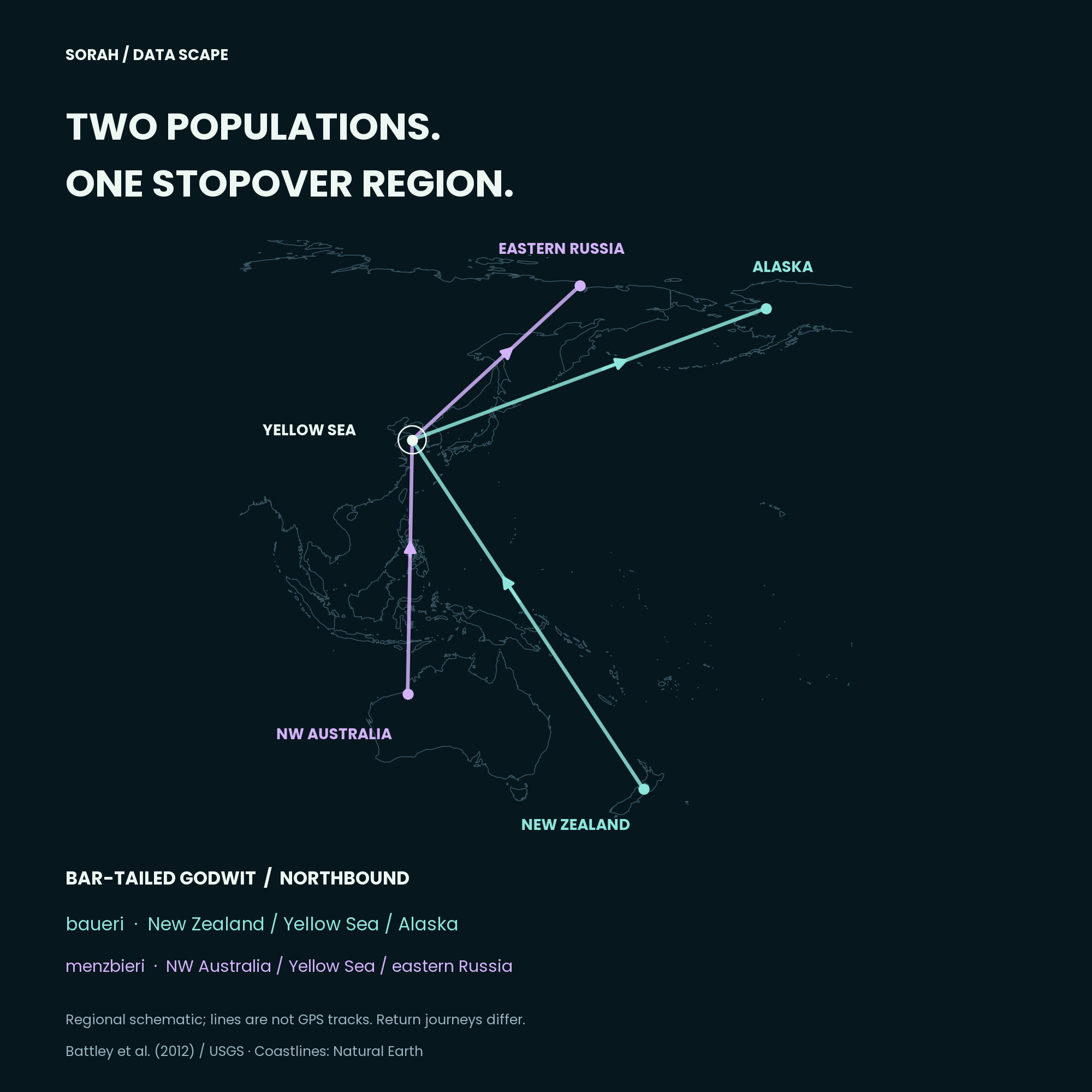
Regional schematic based on Battley et al. (2012). Points are representative anchors, not tracking fixes; southbound journeys differ. [6]
The regional diagram here is drawn from that study, separately from the compiled globe. It is not a pair of tracks extracted from the animation. Keeping the two sources distinct matters: a species name alone does not tell us which population, season or journey a line represents.
A conservation question needs that specificity. Once a journey has a population and a direction, “somewhere along the way” becomes a set of places that can be examined. The wide view supplies context; the closer view supplies a question that field evidence can address.
Reading decline alongside movement
Studds and colleagues analysed shorebird counts from Australia and New Zealand for 1993–2012. Groups with greater Yellow Sea reliance had steeper declines. The comparison below reproduces reported group averages and their 95% credible intervals. [5]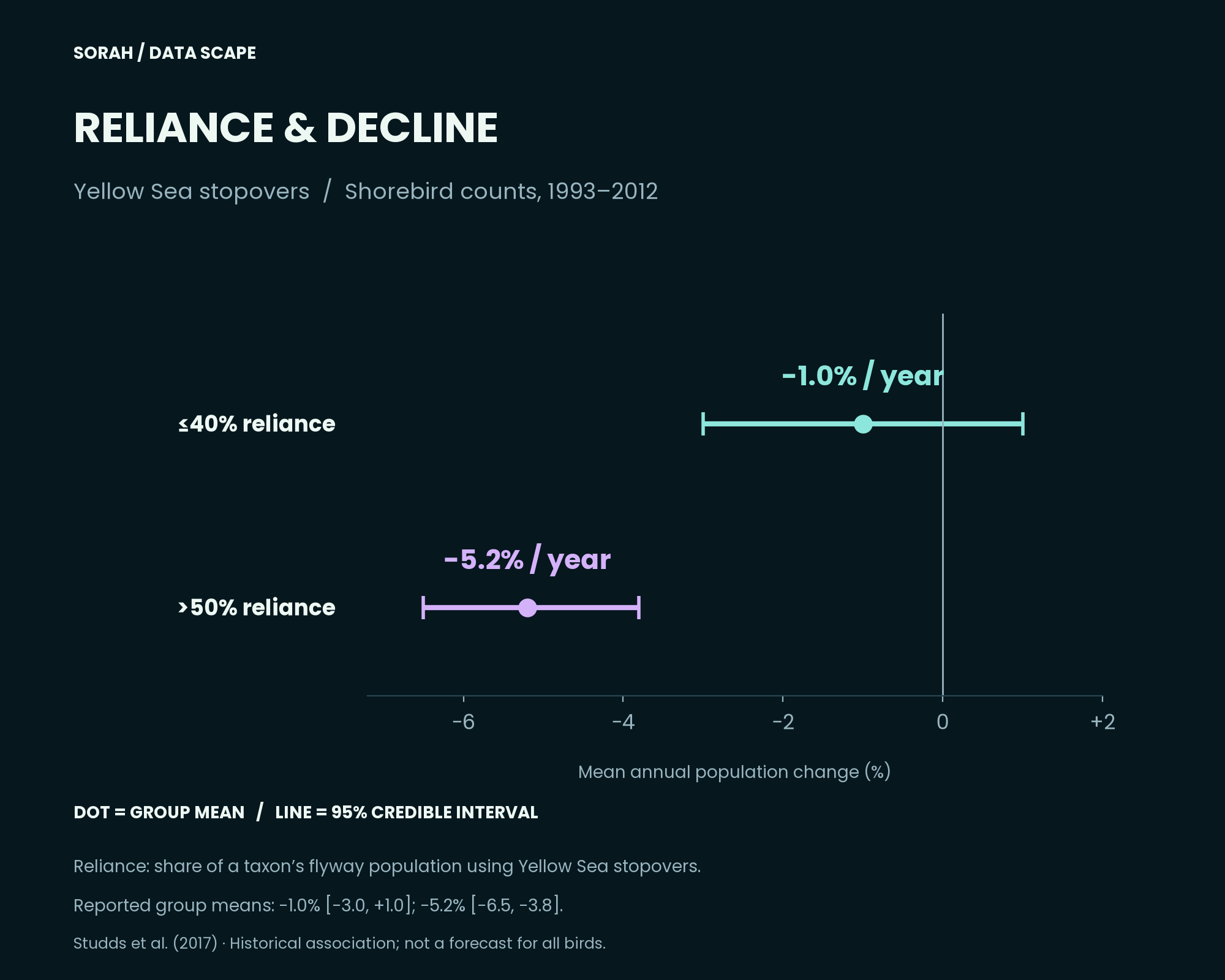
Reported group means, 1993–2012. ≤40% reliance: −1.0%/year (95% CrI −3.0 to +1.0); >50%: −5.2%/year (−6.5 to −3.8). Dots show means; lines show uncertainty. Studds et al. (2017). [5]
The globe and this chart do different jobs. One describes regional connections; the other estimates change in bird abundance over a defined period. Reading them together helps frame a question about stopovers. It does not turn a luminous route into a measurement of loss.
The intervals are part of the finding, not decoration. And these historical associations are neither a decline rate for all 112 mapped species nor a forecast for 2026. A graphic should make the relationship easier to see while keeping those boundaries visible.
The places beyond the lines
BirdLife reports that 58% of 1,099 Key Biodiversity Areas assessed for migratory birds during 2016–2025 were in poor or very poor condition. That is a share of assessed sites—not a percentage of global habitat area, or birds, lost. [2]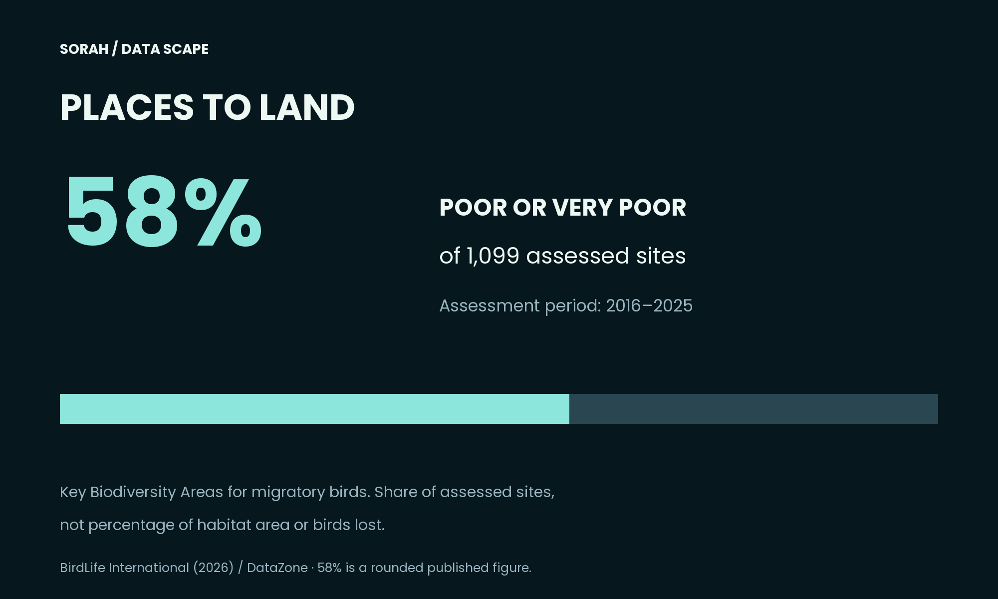
Share of assessed sites, not habitat area or birds lost. BirdLife International (2026). [2]
A site can look like a single point at this scale. At ground level, the questions multiply. Is there somewhere to feed? Somewhere to rest? Can birds use it when they arrive? None of those conditions can be established from the brightness of a line on a globe. They require attention to the place itself.
This is where the image becomes useful beyond its first impression. We can ask which evidence belongs at which scale: a compilation to reveal connections, a tracking study to identify a journey, and observations on the ground to assess a site. Leaving the gaps visible makes the next question clearer.
Will migratory birds be able to keep making these journeys? This map cannot settle that question. It can change where we look for an answer. After watching how far birds travel, we can start asking what remains along the way.
Follow one light back to the ground. There is a named place at the end of that line. The next part of the journey depends on what a bird finds there.
About the data
Globe: Qiu v3, all 112 species and 1,454 routes. Regional nodes are interpolated; light count, speed and height are illustrative. One conflicting-species row was quarantined and 96 consecutive duplicate nodes removed. Some records—including North Atlantic region names assigned to Far Eastern Curlew—remain unverified; individual routes should not be treated as confirmed tracking evidence. Supporting figures use separate studies and site assessments. No population decline or habitat loss was calculated from the route map. Sources checked 25 September 2026.Sources
[1] Yunbo Qiu (2024) — A global dataset of directional migration networks of migratory birds, v3 / CC0 [2] BirdLife DataZone — The network of sites used by migratory birds is degraded and fragmented [3] Natural Earth — 1:50m land polygons (public domain) [4] SORAH Design System — live system.json / 1.6.0 [5] Studds et al. (2017) — Yellow Sea stopover reliance and shorebird population trends, 1993–2012 [6] Battley et al. (2012) — Contrasting migration patterns in bar-tailed godwit subspecies / USGSAuthor
SORAH Editorial
September 25, 2026