Published on 23/September/2026 · Climate
Could This Year’s El Niño Become the Strongest Since 1950?
By SORAH Editorial
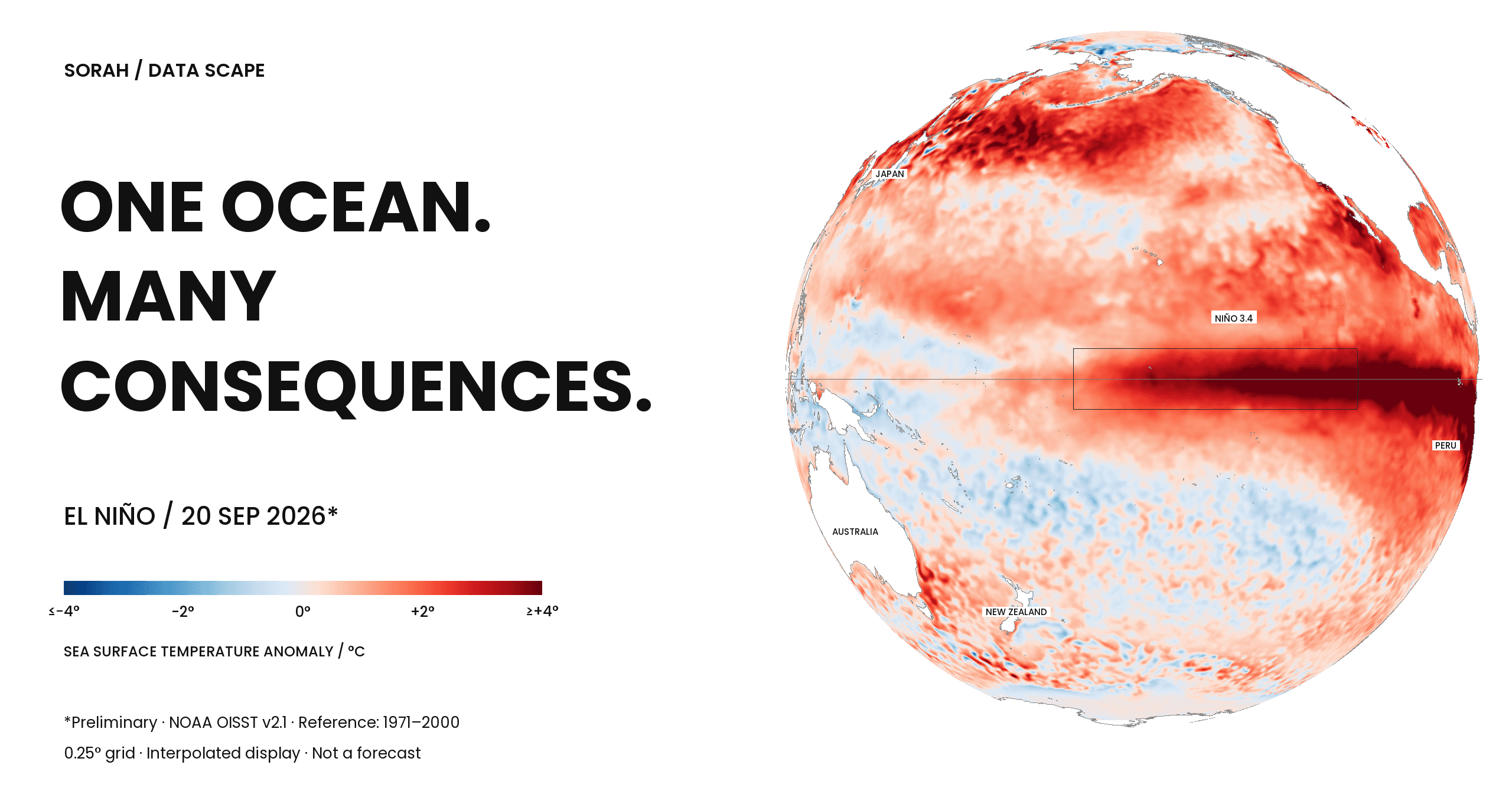
A red band stretches across the equatorial Pacific. Compare January and September 2026: areas shown in blue in January appear red in September. How does a change in ocean temperature alter where rain falls?
A red band stretches across the equatorial Pacific. Compare the maps for January and September 2026: areas shown in blue in January appear red in September. The colours record how far the temperature at the ocean’s surface departs from its seasonal average.
In its September 10 discussion, NOAA put the chance of an El Niño exceeding the strength of previous events since 1950 at 75% for October–December 2026. That forecast uses the three-month Relative Oceanic Niño Index, or RONI. A record has not yet been established. The ocean and atmosphere both show a strengthening event, which NOAA expects to intensify through the end of the year.[1]
How does a change in ocean temperature alter where rain falls? These three maps give us a place to begin.
Warmer than what?
Sea temperatures vary with place and season. Each map compares a day’s temperature with the average expected at that location and time of year. The difference is a sea-surface temperature anomaly: red for warmer, blue for cooler. The underlying NOAA dataset uses a 1971–2000 reference period.[2]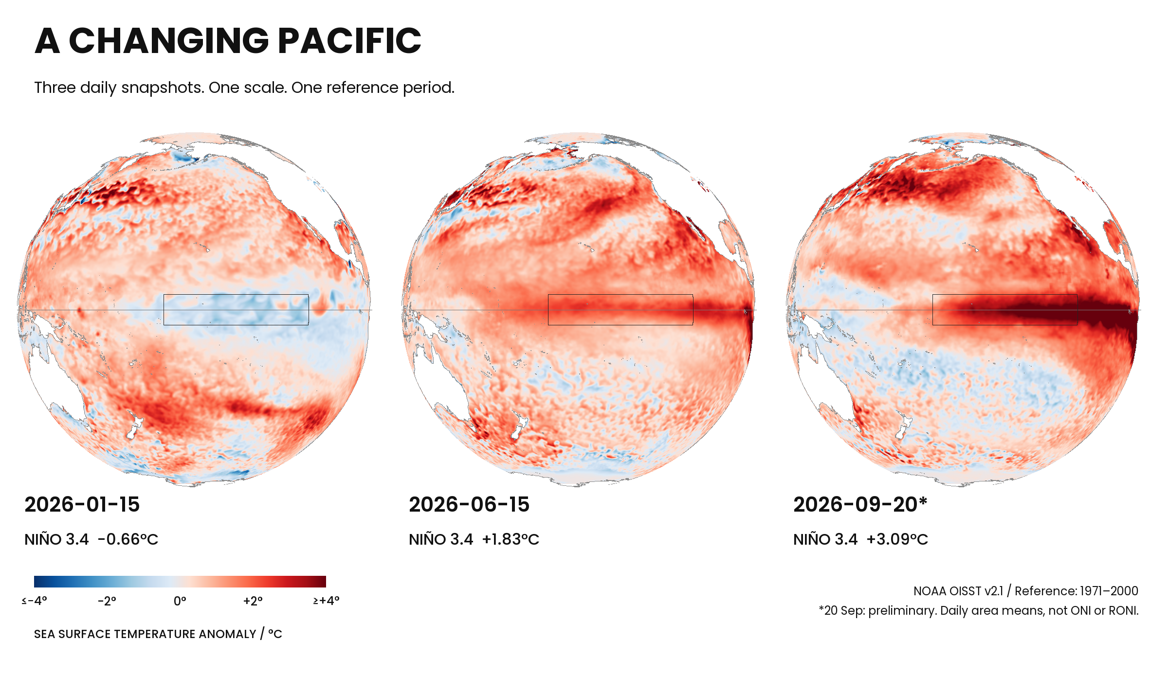
Figure 1. Three daily snapshots. Mean anomalies in Niño 3.4: −0.66°C, +1.83°C and +3.09°C. September 20 is preliminary. These are daily regional averages, not monthly ENSO indices. Data: NOAA OISST v2.1. Analysis and graphics: SORAH.
The rectangle marks Niño 3.4, an area straddling the equator in the central Pacific. SORAH’s calculation gives average anomalies of −0.66°C on January 15, +1.83°C on June 15 and +3.09°C on September 20. Across these three days, the region went from below its seasonal baseline to well above it.
That final number describes one region on one day. It does not mean the whole ocean warmed by 3.09°C since January. Nor is it the Relative Oceanic Niño Index, or RONI, used by NOAA to monitor ENSO. RONI accounts for temperatures across the global tropics and uses a three-month average. Its calculation and baseline differ from those used here.[3]
The wind moves water. The water influences the wind.
Normally, trade winds blow westward along the equator, pushing warm surface water toward Asia. In the eastern Pacific, colder water rises from below to replace surface water moving away. This upwelling helps maintain a contrast: warmer water in the west, cooler water in the east.[4]During El Niño, the trade winds weaken and warm water spreads into the central and eastern Pacific. The reduced east–west temperature contrast alters atmospheric circulation, feeding back on the winds. Ocean and atmosphere influence each other. The precise triggers of an event remain an active area of research.[5]
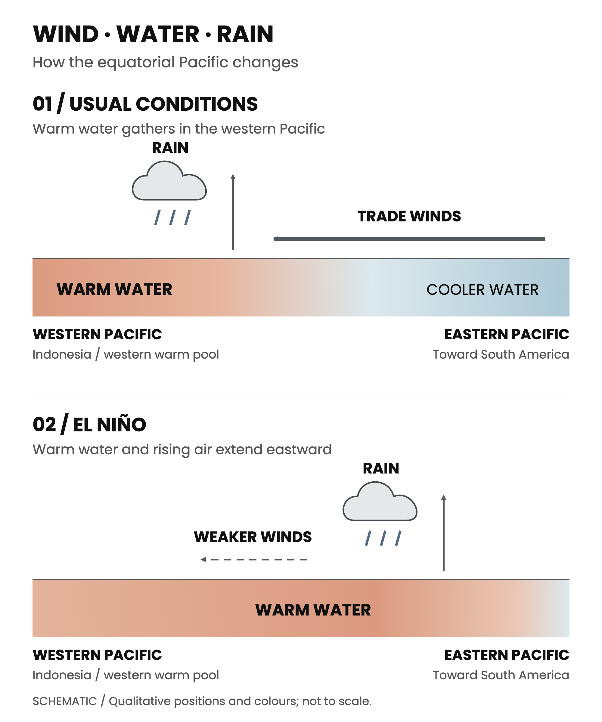
Figure 2. Wind, warm water and rainfall. An original schematic of typical conditions, based on NOAA and JMA explanations. Positions, widths and arrow lengths are illustrative. This is neither observed data nor a forecast for 2026.[4–6]
Moist air tends to rise over warm tropical seas, allowing clouds and rain to develop. Air rising in the western Pacific, flowing eastward aloft and sinking farther east forms part of the Walker circulation. As the warm-water region extends eastward, the main area of rising air and rain shifts with it.[6]
A change in the Pacific reaches distant seasons
The effects travel through the atmosphere. Changes in tropical rainfall disturb wider circulation patterns, including upper-level winds that help guide weather systems. These relationships between distant regions are known as teleconnections.[7]During Northern Hemisphere winter, for example, El Niño tends to shift the Pacific jet stream southward, favouring wetter conditions across the southern United States. That is a seasonal tendency derived from past events and physical understanding. It is not a timetable for rain in a particular city in 2026.[3]
On land, the amount and timing of seasonal rain matter to soil moisture and water supplies. One region may be waiting for rain to return while another prepares for unusually wet conditions. Monitoring the distant Pacific helps inform decisions in agriculture and water management, among other sectors.[8]
One temperature difference cannot determine a region’s future
No two El Niño events unfold identically. The location and timing of ocean warming vary; conditions in other oceans and fluctuations within the atmosphere also matter. A stronger event does not produce a proportional increase in rainfall everywhere.[3]The red on an anomaly map also reflects the reference period chosen. Long-term warming and slower ocean variations can contribute to departures from that baseline. We cannot assign every warm patch to El Niño alone. The location, averaging period and comparison years belong alongside the number.[9]
Beyond the three maps
These maps were drawn from NOAA’s analysis combining satellite, ship, buoy and other observations. Bringing measurements onto a common grid makes the broad pattern visible; keeping the same colour scale lets us compare the three days.[2]To follow El Niño, we need to place that temperature record beside observations of wind and rain. Where did the water warm? How did the air respond? Which regions became wetter or drier? Reading those records together helps us investigate relationships that a single map cannot establish.
The next observations will add to that account. Beyond the three moments shown here, measurements of the ocean and atmosphere continue.
About the data and graphics
Maps use the anom field from NOAA OISST v2.1, relative to 1971–2000. SORAH calculated a cosine-latitude-weighted mean of valid native 0.25° grid cells in Niño 3.4 (5°S–5°N, 170°W–120°W). Dates: January 15, June 15 and September 20, 2026; the final date is preliminary. These are daily snapshots, not a continuous time series. Values are rounded to two decimal places. Colours span −4 to +4°C; values outside that range use the end colours. The maps do not measure total ocean heat content. Data and sources checked September 22, 2026.Sources
- NOAA CPC — ENSO Diagnostic Discussion, 10 September 2026
- NOAA NCEI — Optimum Interpolation Sea Surface Temperature
- NOAA NWS — What is El Niño & La Niña? / ENSO Impacts, February 2026
- NOAA Ocean Service — What are El Niño and La Niña?
- JMA — FAQ: definitions and mechanisms
- NOAA — The Walker Circulation: ENSO’s atmospheric buddy
- NOAA Climate.gov — How El Niño and La Niña affect the winter jet stream and U.S. climate
- NOAA Climate.gov — El Niño and La Niña: Frequently asked questions
- JMA — FAQ: terms and indices
Author
SORAH Editorial
September 23, 2026