Published on 09/October/2026 · Nature
Birds across North America, a changing seasonal pattern.
By SORAH Editorial
Across North America, from spring to winter. Quiet particles reveal changing seasonal distributions from weekly models of six species.
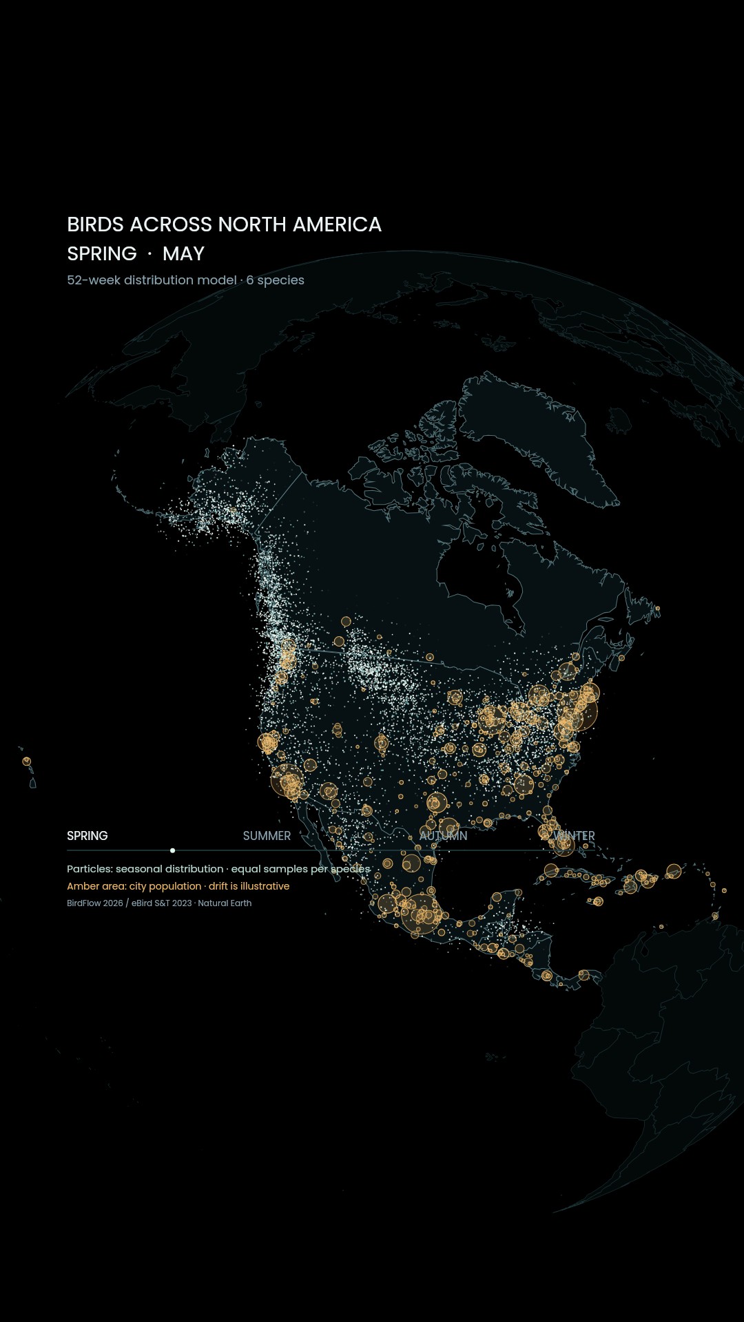
A season across North America
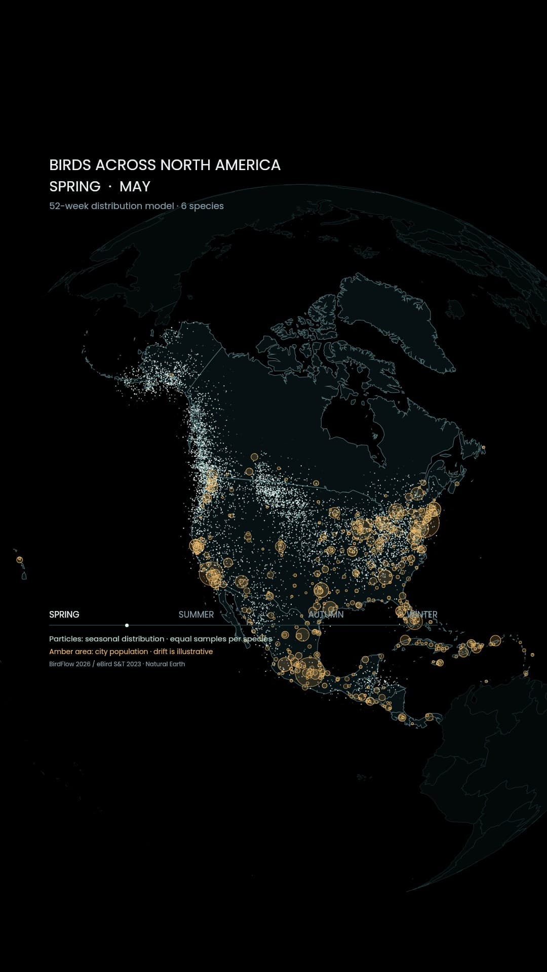
In spring, bird distributions spread north across North America. Mountains, seas, farmland and cities lie between summer and winter ranges. A view spanning Canada, Alaska, the contiguous United States, Mexico, Central America and the Caribbean makes seasonal change visible across borders.Migration allows birds to use food and breeding conditions that change with the seasons. Journeys vary from short movements to continental travel. A map fixed to one date can conceal the different roles that the same place plays through the year.[1]
From observations to a movement model
This film starts with the BirdFlow models released in 2026. Weekly distributions estimated from eBird observations are combined with information about movement to model transitions through a representative annual cycle. We selected six species and follow their distributions from spring to the next winter. This is not live tracking of birds during 2026.[2][3]The species are Bay-breasted Warbler, Baltimore Oriole, Chestnut-collared Longspur, Golden-crowned Sparrow, Rufous Hummingbird and Western Tanager. Each contributes the same number of samples. Dense particles therefore show where these equally weighted model distributions gather, not a ranking of places by the true number of birds.
Banding offers another way to learn about movement: an individually marked bird can be identified when encountered elsewhere. The photograph from the USGS facility in Laurel, Maryland, brings that fieldwork into view. Population models and records of individual birds address questions at different scales.[4]
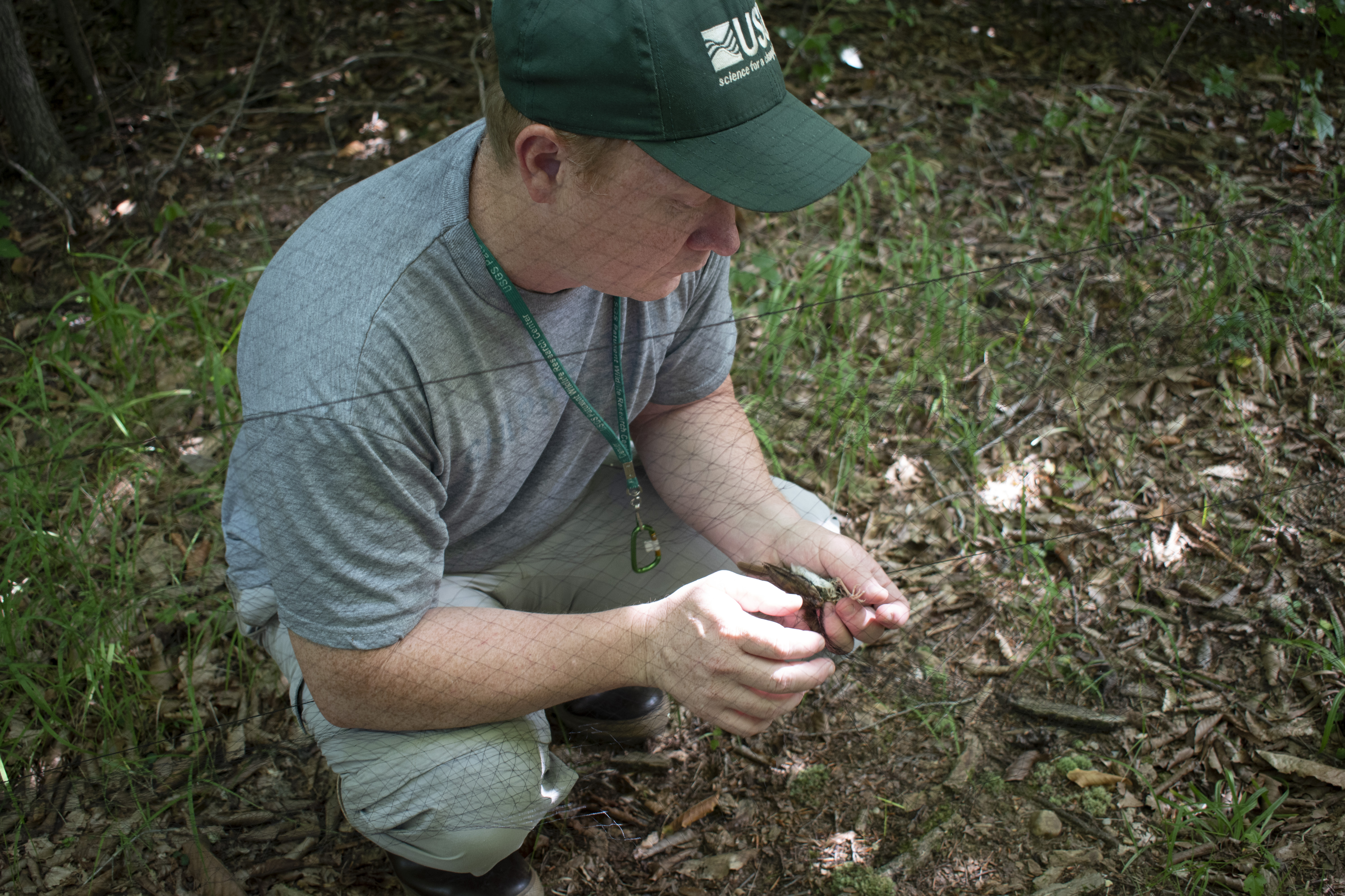
USGS biologist Matthew Rogosky handling a songbird before banding in Laurel, Maryland. Capture date not supplied; source page published 31 July 2019. Chelsea Steinbrecher-Hoffmann / USGS · Public Domain Source
Meeting the city at night
Amber circles place cities alongside those seasonal distributions. Their areas represent Natural Earth population values. A coastal circle may extend over the sea because it is a proportional symbol, not the mapped boundary of an urban area.[5]Many migrants travel at night. Artificial light can attract birds, adding flight effort and contributing to collisions with buildings. The U.S. Fish and Wildlife Service describes these effects, including the importance of cloudy and foggy conditions.[6]
Population circles cannot stand in for measured light pollution or collision counts. This image establishes a spatial comparison between selected bird models and cities. Understanding a particular hazard requires local evidence about lighting, weather, buildings and birds.
Places to pause
Turning off unused lights and illuminating only the places that need them are tangible ways to reduce nighttime light.[6] Migrants also need places to feed and rest between sections of a journey. The landscape below them matters as much as the distance ahead.Particles gather differently around the same city in spring and autumn. Watching that slow shift invites attention to the season in which birds pass through, and the places where they can pause. A continental map connects distant breeding and wintering grounds with the ordinary towns in between.
Data and representation
Six species selected from the quality-reviewed 2026 BirdFlow release: Bay-breasted Warbler, Baltimore Oriole, Chestnut-collared Longspur, Golden-crowned Sparrow, Rufous Hummingbird, Western Tanager. A 52-week representative annual cycle based on eBird Status & Trends version year 2023, not live 2026 observations or a single year of individual tracking.600 samples per species, 3,600 source samples total; display particle counts differ. Published weekly joint marginals are row-normalized into conditional transition probabilities, then sampled with a fixed seed. Fixed within-cell jitter is at most 0.32 cell width. Distributions between weekly steps are graphically interpolated. Equal sampling across species does not estimate total bird abundance, combined density or relative abundance among species.
The model is memoryless, so detailed daily paths and annual site fidelity are not recovered. The authors generally recommend trajectory analyses shorter than one year. This display illustrates population-level seasonal change; it does not test the return of an individual bird to a particular site.
The map spans North America, including Canada, Greenland, the US, Mexico, Central America and the Caribbean. Selected models include Alaska but none covers Hawaii, where no particles are invented. Absence of particles is not absence of birds. Natural Earth POP_MAX city populations ≥100,000 use mixed census years. City-circle breathing is a display effect, not a measured annual change in artificial light.
Weekly positions from 600 samples of each of six species are binned into 150-km equal-area cells, spatially smoothed with a 0.55-cell Gaussian kernel and drawn as particle density. Species are equally weighted, not scaled by real populations. Particles drift only about 3 pixels around fixed locations and do not depict individual paths. Coverage is limited to the selected six species, not a census of all birds or regions in North America.
Sources
- Cornell Lab · How, why and where birds migrate
- BirdFlow · 2026 model release
- BirdFlow · Model overview and limitations
- USGS · Banding a songbird
- Natural Earth · Populated Places
- USFWS · Collisions and nighttime lighting
- Chen et al. 2026 · Population-level migration modeling
- BirdFlow model archive · CC BY 4.0
Author
SORAH Editorial
October 9, 2026