Published on 30/September/2026 · Climate
Antarctica: the changing height of an ice sheet.
By SORAH Editorial
Hold the continent still, and watch its surface change. A common 1995 baseline reveals where the ice sheet has become lower or higher.
Hold the continent still, and watch its surface change. A common 1995 baseline reveals where the ice sheet has become lower or higher.
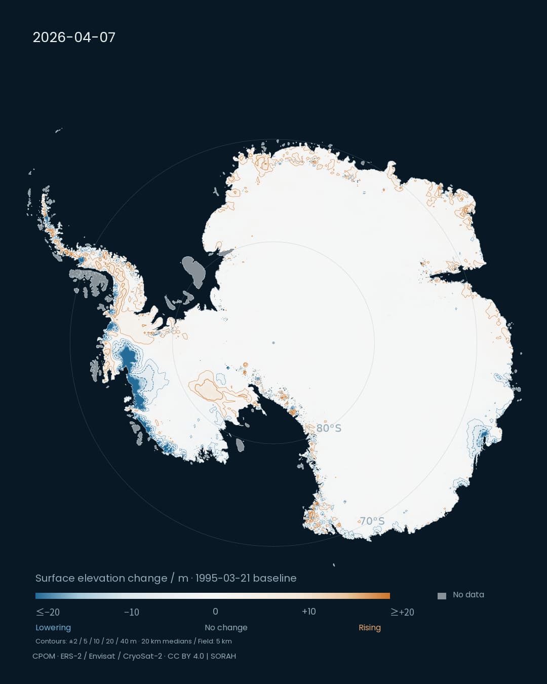
The outline stays in place. Inside it, blue and orange lines develop across a white continent. Blue marks a lower ice surface; orange marks a higher one. Every scene measures the difference from the same baseline: 21 March 1995.[1]
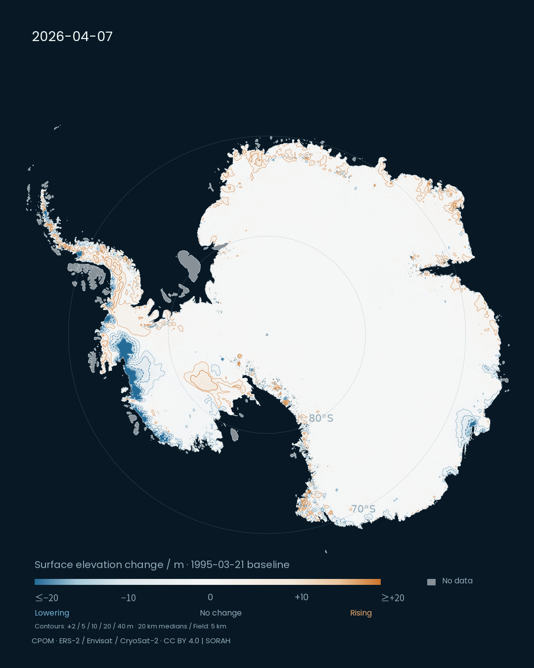
Product epoch: 7 April 2026. Cumulative surface elevation change from 21 March 1995. White marks zero change; gray marks missing values.[1][2]
Explore ice-sheet change in Data Scape
Before reducing Antarctica to a single average, this view asks us to notice where change occurs. Blue contours gather along some coastal sectors. Orange contours appear elsewhere. Lowering and rising share the same map, making the regional differences visible.
One baseline across three decades
The maps use the Centre for Polar Observation and Modelling’s cumulative elevation-change product. Radar-altimeter records from ERS-2, Envisat and CryoSat-2 are brought onto a common grid. We selected five epochs—1996, 2000, 2010, 2020 and 2026—and kept the projection, extent and scale fixed.[1][2]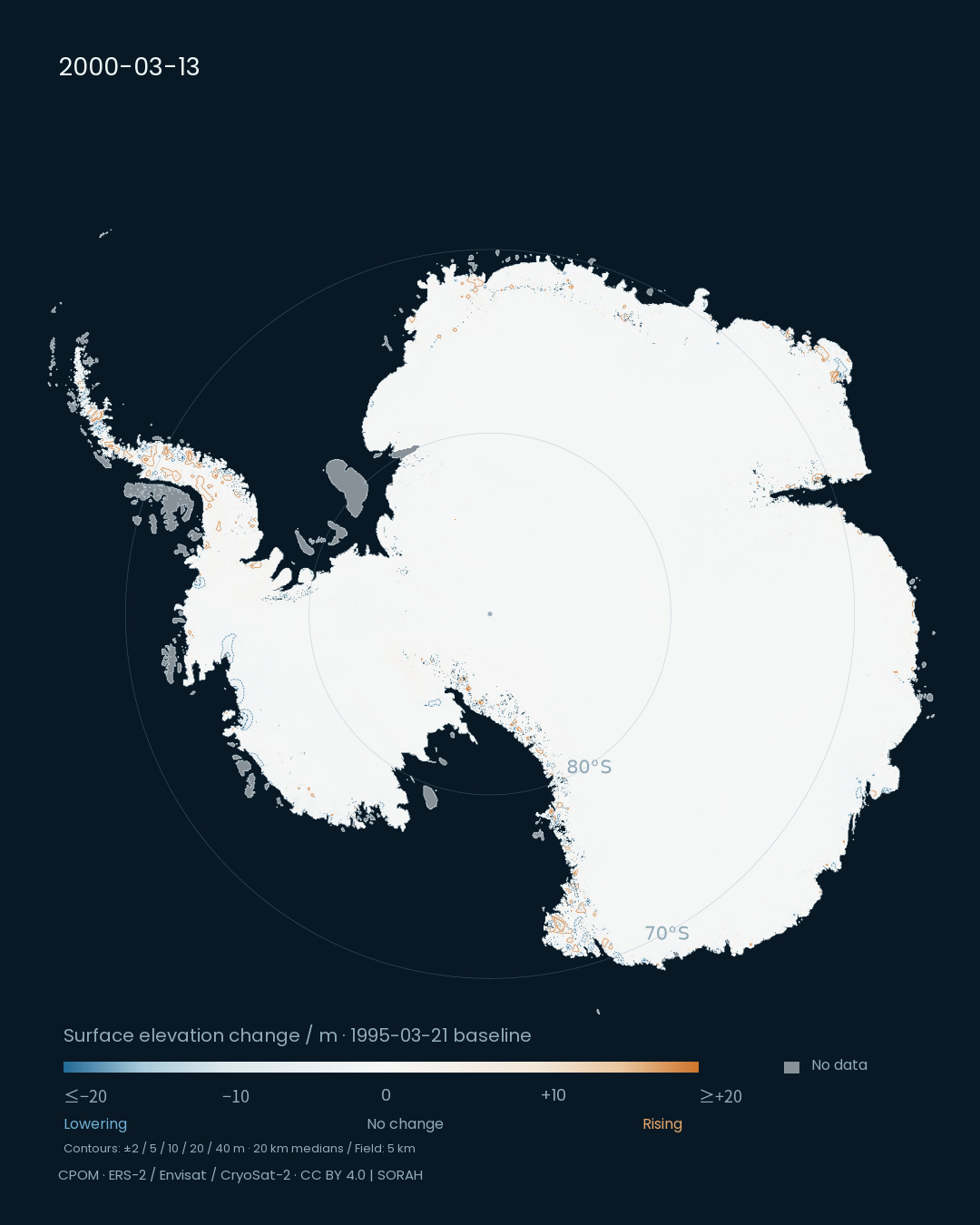
Product epoch: 13 March 2000. The baseline, projection and color scale match the 2026 image.[1]
Each frame shows the cumulative difference from 1995, rather than the change since the preceding frame. A pale area therefore does not necessarily represent a surface that remained motionless throughout the intervening years. It represents a small difference between that epoch and the baseline.
What moves the surface up or down?
Snowfall, snow compaction and ice flow all contribute to surface-height change. A lower surface is not a direct measurement of local melting. A higher surface is not exposed ground: the orange color measures change in height.[2]Ocean-driven thinning and changes in ice flow provide important context in West Antarctica. A 1992–2017 study described by ESA in 2019 separated snowfall variability from longer-term ice imbalance. That distinction matters when reading this later map. The visualization locates change; attributing its causes requires additional observations and analysis.[5]
From height to mass
A metre of height change alone does not specify a mass change. The area involved and the density of snow or ice also matter. Nor can these metres be read directly as metres of sea-level rise.[2]IMBIE assesses ice-sheet mass balance using altimetry, gravimetry and estimates of ice input and output. Its dataset published in 2026 covers Antarctica from 1979 to 2023. That record measures a different quantity and ends earlier than this 2026 elevation map. Together, the two approaches connect regional surface change with the ice sheet’s wider balance.[3]
Two poles, two measurements
The Arctic counterpart asks how far floating sea ice extends. This Antarctic view asks how the surface of land ice changes. A shared polar composition lets the images sit together while retaining those different measurements.Look past the familiar outline once more: blue contours overlap near parts of the coast, while orange contours appear in other regions. Keeping those differences visible gives the next observation somewhere precise to enter the story.
Note · Reading the maps and film The native field is 5 km; contours use 20 km cell medians at ±2, 5, 10, 20 and 40 m. Negative contours are blue and dashed; positive contours are orange and solid. Colors saturate at ±20 m. Provider gap filling and polar extrapolation are included; floating shelves are not given a fixed fill. Dates identify product epochs, not one-day observations. The 19-second film connects five epochs with editorial dissolves and hides dates during blends. Equal screen intervals do not represent equal elapsed years.[1][2]
Sources
Author
SORAH Editorial
September 30, 2026